The Family Partnership
The Family Partnership is on a mission to build strong families, vital communities, and better futures for children by removing barriers and clearing the path to success for those who have experienced inequity, poverty and various forms of trauma.
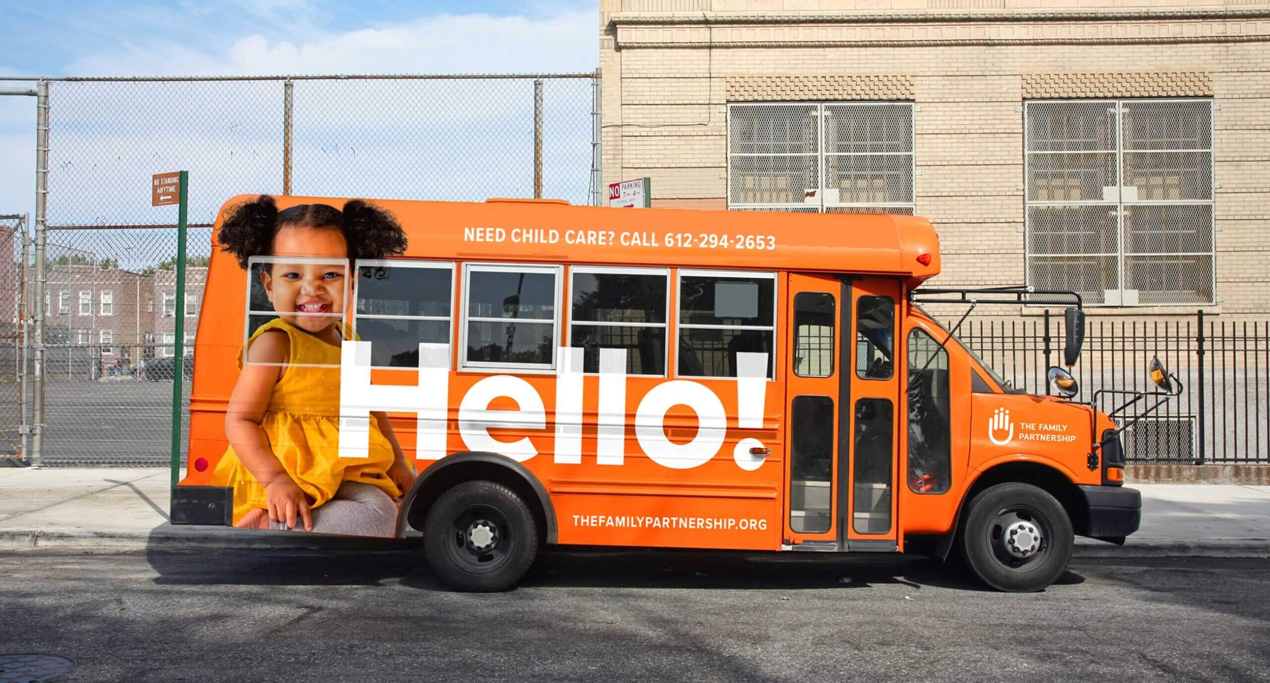
The challenge
The 140+ year-old agency was gaining national attention for cutting-edge work in brain science, and needed a brand update and better digital presence to engage new audiences and stakeholders.
The messaging hierarchy for the various services offered by The Family Partnership was outdated and confusing. The emphasis on a two generation (2Gen) approach brought urgency to explain how the agency’s programs were related in a holistic way to help families heal and break the cycle of intergenerational trauma.
The organization was looking to re-energize its Capital Campaign for a new building that had already received funding from the State of Minnesota. Better messaging and branding was vital to appeal to funders.
The discovery
An inclusive process of challenging conventions
During the initial brand refresh, 5IVE engaged with the organization’s leadership and gained trust through the discovery and design process. Asking hard questions and challenging conventions that no longer served the relevancy of the impact led to a close partnership and expanded project scope that ensured a comprehensive brand strategy supported all the changes.
That led to an agreement that The Family Partnership website was dramatically outdated in content, lacked visual appeal, easy navigation and that its backend functionality was not easy for staff to maintain.
To center our solutions on audience-informed insights, we began stakeholder listening sessions to uncover key barriers for audience engagement, map needs, and facilitated conversations with internal and external audiences.
The solutions
Bold leadership reflected in a refreshed
brand identity
As part of the brand strategy and need to attract supporters and engage stakeholders, the recommendation to refresh the organization’s logo and branding was put on the table. 5IVE’s team concluded that it was important to retain familiar elements from the logo since it had been redesigned in the last five years as part of the agency name change to The Family Partnership.


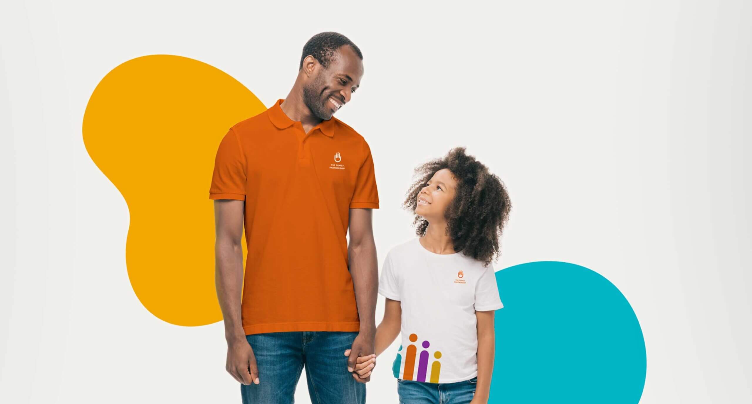
Visual impact rooted in simple design solutions
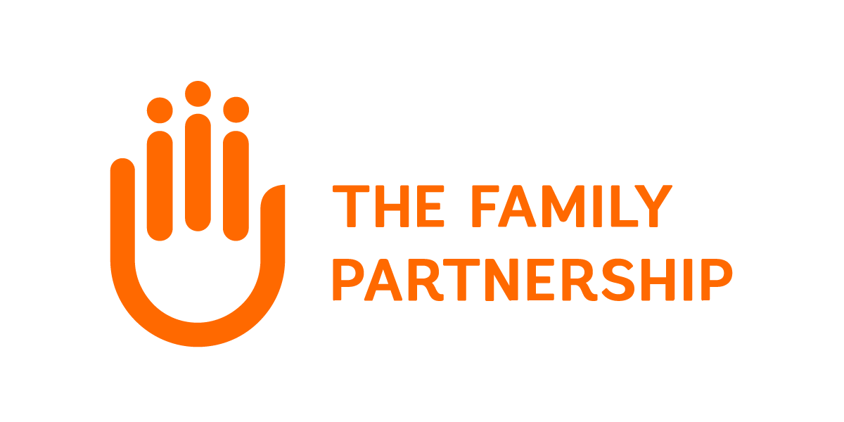
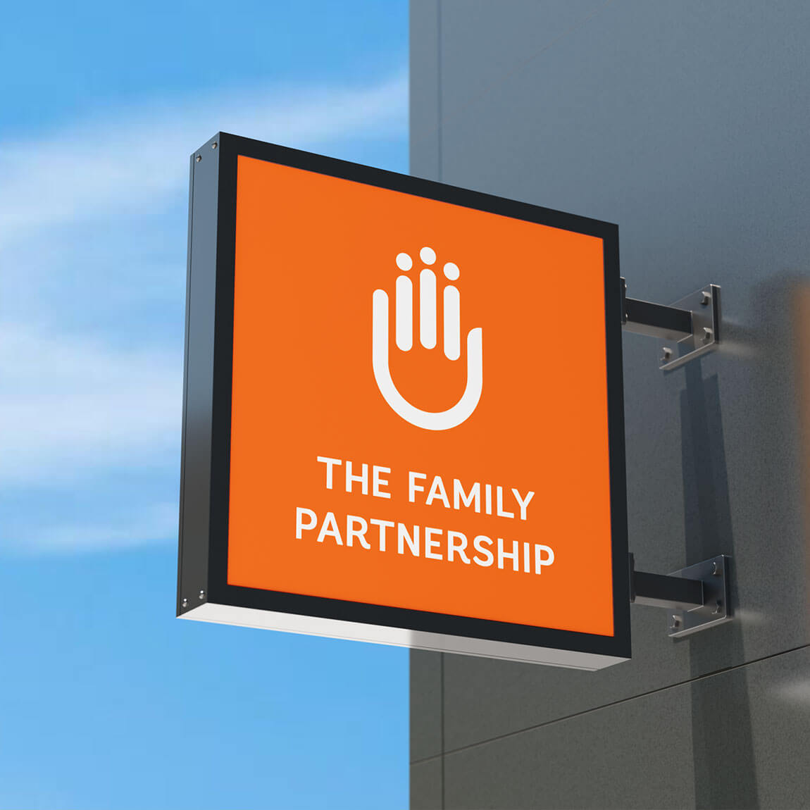
The logo mark of the hand was retained and technically adjusted to look more human, memorable and graphically balanced.
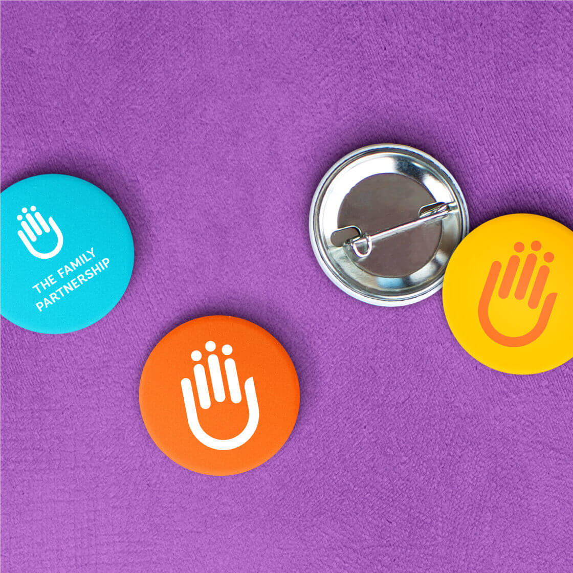
A single primary color (orange) was selected to replace a muted four-color design that lacked authority and visual impact.
The new primary brand color represents the bright future of the organization and the healthy community it strives to convene. It is both bold and inviting, warm and inclusive, reflecting The Family Partnership’s culture.
A set of rich secondary colors gives this 140 year-old brand a new life, youthful tone and diversity that reflects not only the communities it served, but also the hope, strength and healing it strives to provide each one of the program’s clients and participants.
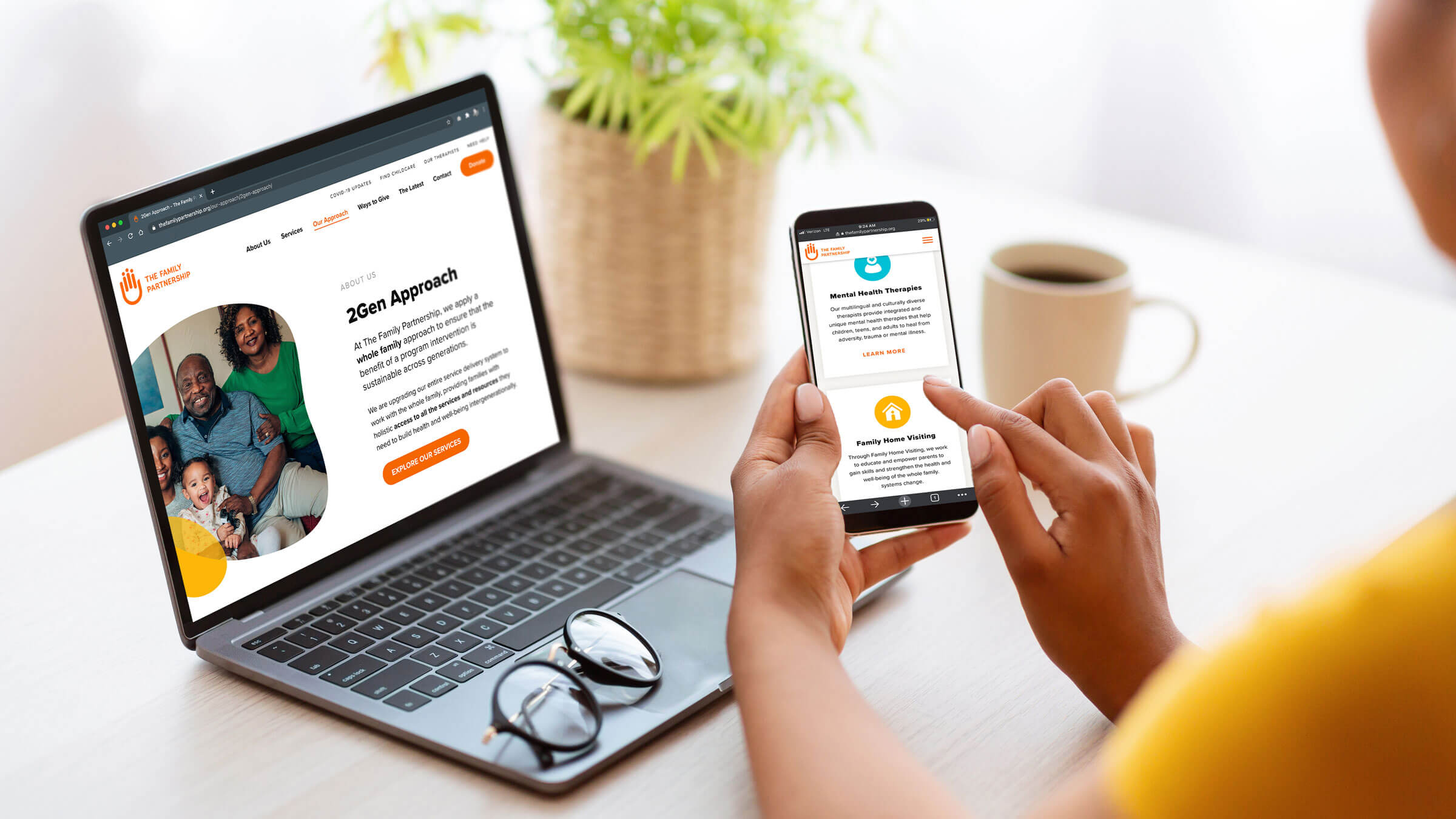


“A website is an organization’s window to the world and an essential communication channel for engagement. One important area to get right is the pages covering what the organization does and the benefits it delivers to its audiences. The Family Partnership welcomed our suggestions to reframe how the areas of impact and services were structured and understood why it’s key not to let internal structures and language diminish the effectiveness of the new site’s navigation, user experience, and content accessibility.”
Boriana Strzok, Founder & CEO, 5IVE
Designing a new website ready to drive online engagement
One thing became clear to all parties involved in this project, including Board Committee members – a complete redesign of the organization’s website was needed to help structure the information and simplify messaging to the audiences who visit the site most frequently.
The redesign steps and solutions that helped transform the web experience:
- Conduct inclusive listening sessions. An audit of all audiences, key stakeholders and in-depth conversations with program leads provided clarity for the purpose and audiences the website should serve.
- Rename the main programs and group them in a new set of categories. 5IVE made this significant recommendation to the leadership that was approved and adopted. This change was implemented to create a more clear distinction between the organization’s main services and the approach or methodology being used, which was previously mixed and led to ongoing confusion.
- Clearly articulate the value proposition and support easy navigation. The updated brand strategy and programming transformation communicated the work of the organization in a more accessible, easy-to-understand way that’s centered on the user vs internal lingo.
- Elevate unique positioning and storytelling. We also created access points for the “wonks” and funders interested in the methodology and science behind the agency’s work in the areas of 2Gen Approach, Executive Functioning, etc. that allowed them to find and navigate the information in which they’re interested vs having inaccessible, academic language mixed with pages designed for service recipients.
- Design a new website architecture for better user experience that allows audiences to find what they’re looking for quickly and intuitively.
- Apply web content best practices throughout the site, using short paragraphs and engaging, well-structured headlines and tagging.
- Communicate the brand essence through the new branding elements and design. The new organic overlapping shapes represent the coming together of individuals and families from all types and backgrounds. And a set of icons were designed with a nod to the childcare services and essential developmental building blocks the organization provides.
- Integrate stock images that looked authentic was key to balancing the fact that the organization works with real people and has a responsibility to protect the privacy of its clients and program participants.
- Add a clear call-to-action to the main pages to give visitors opportunities to engage further with the content, support the organization, or sign-up for updates.
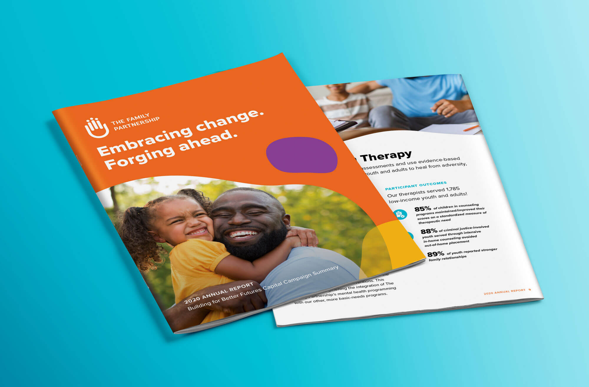
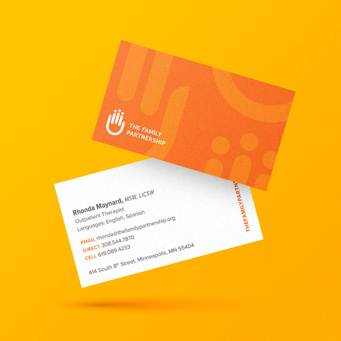
Updated branding and strategy to directly support organizational success
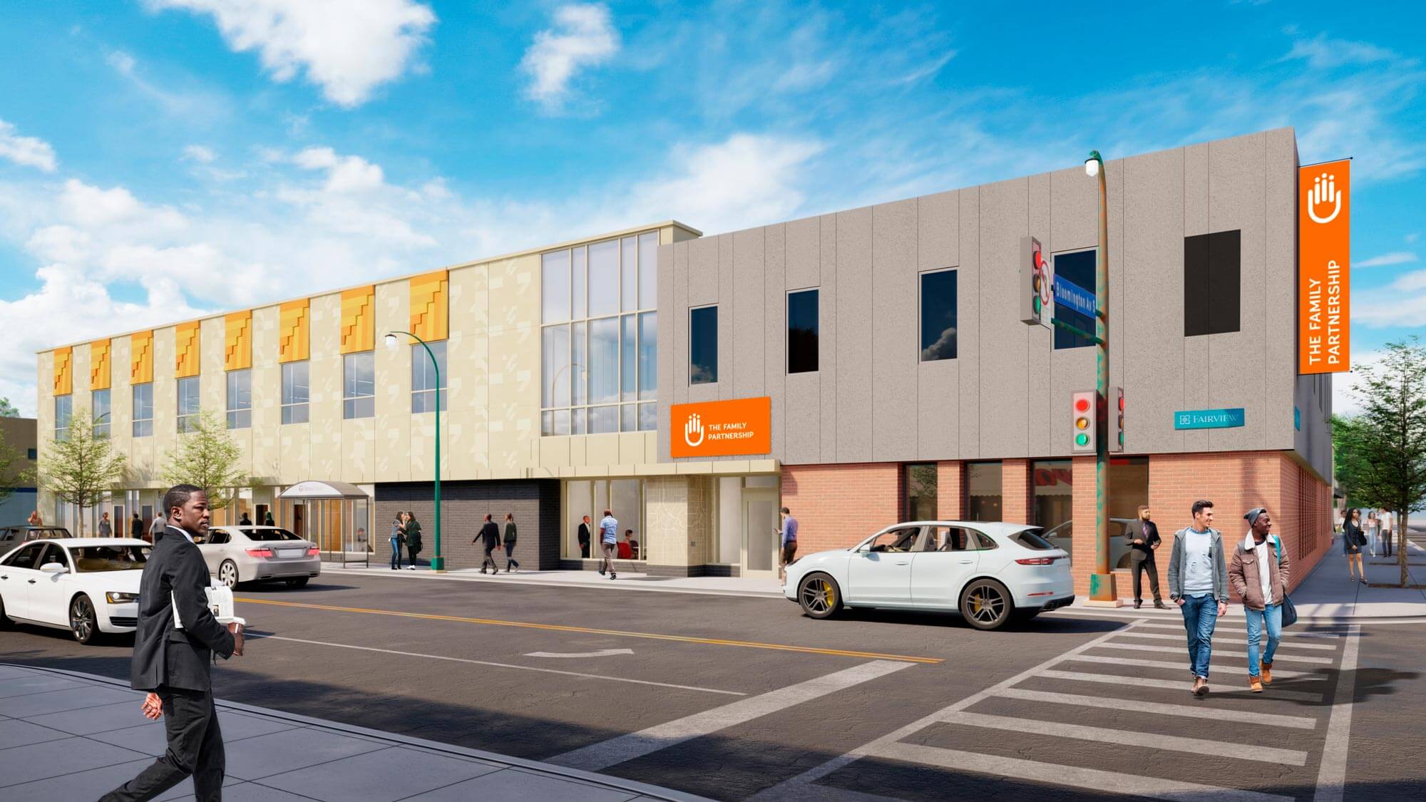
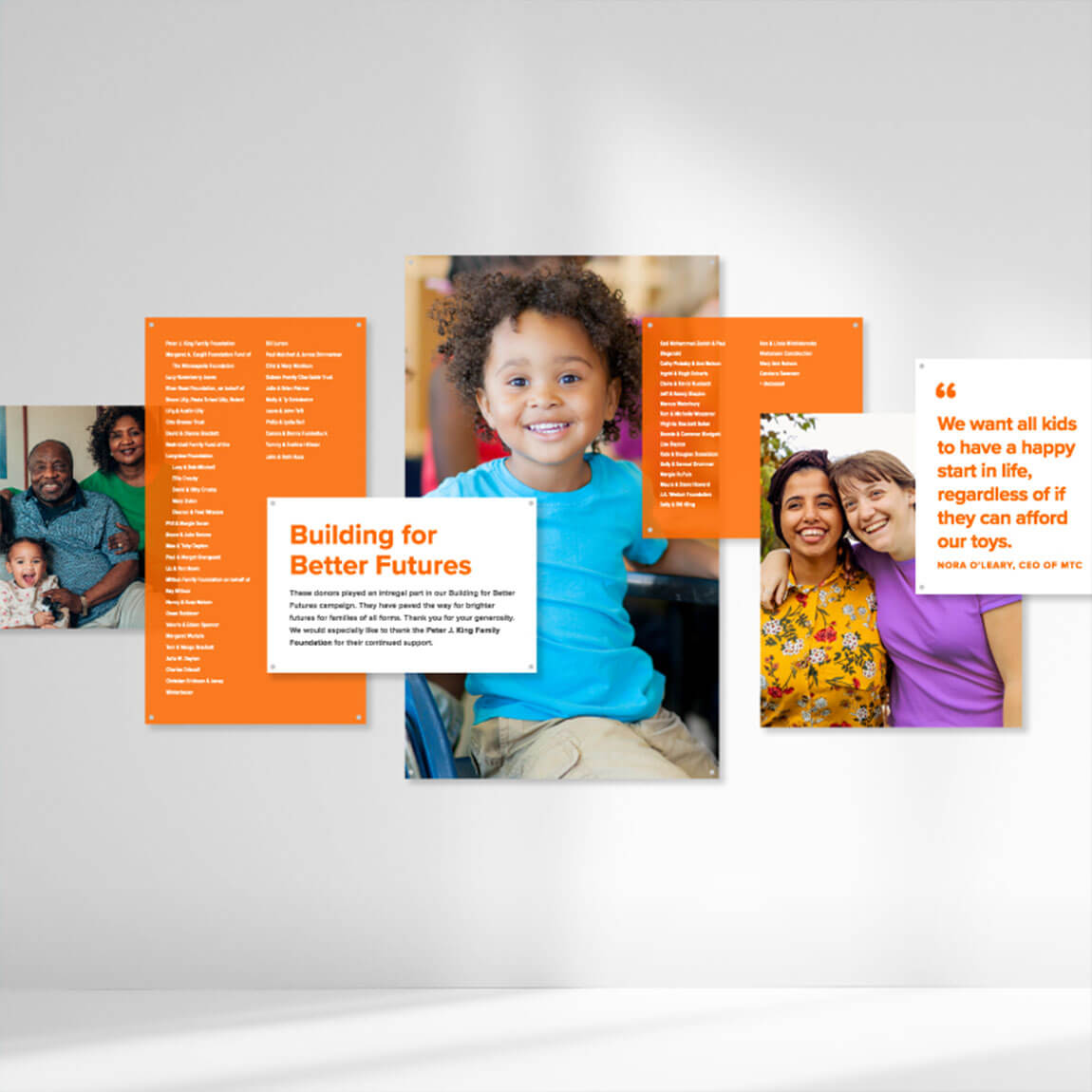
Every part of the new brand materials and updated look aligned and directly aided the fundraising efforts and the implementation of the public phase of the Capital Campaign.
The timely development and launch of the new website and updated brand collateral supported the successful completion of the campaign and provided clear requirements and design standards for the branding of the new building and easy integration with all communication materials.
“The team at 5IVE are amazing out-of-the-box thinkers whose heart is in their work.
Molly Greenman, former President & CEO, The Family Partnership
They really understood our mission and values and brought them forward in our brand. Our extremely complex human service work doesn’t lend itself easily to sound bites, but 5IVE was able to effectively communicate who we are and what we do so people could understand our business.”
Next Project:
Dakota County Library Campaign