LifeGift
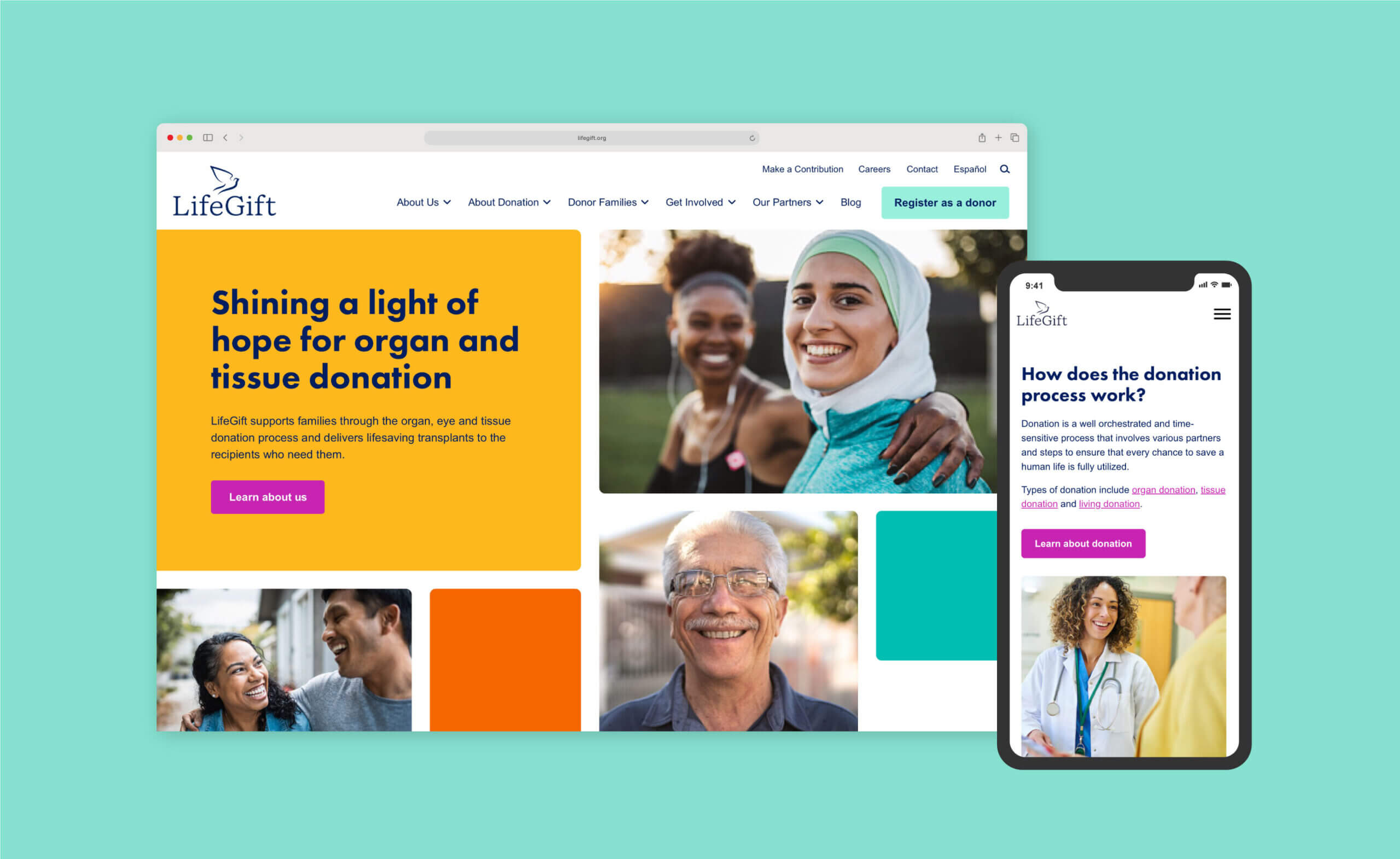
LifeGift supports families through the organ and tissue donation process in Southeast, North and West Texas, delivering life-saving transplants to recipients. A modernized brand identity, refreshed logo and new website provided a platform to better represent the humanity of the work.
The Project
Brand identity refresh, brand strategy and website design
The Challenge
LifeGift is a nonprofit medical organization in Texas that works in the delicate space between life and death, helping grieving families navigate the organ and tissue donation process. This requires coordination with an extensive network of partners, including hospitals, funeral homes, EMS and community organizations, as well as direct or indirect communication with donor families, transplant recipients and the general public. Developing, designing and launching a new digital experience for such a vast group of audiences required understanding and addressing their unique content with well-organized information architecture that is accessible, empathetic and easy to navigate.
The Brand Refresh
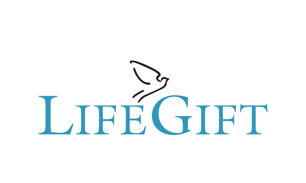
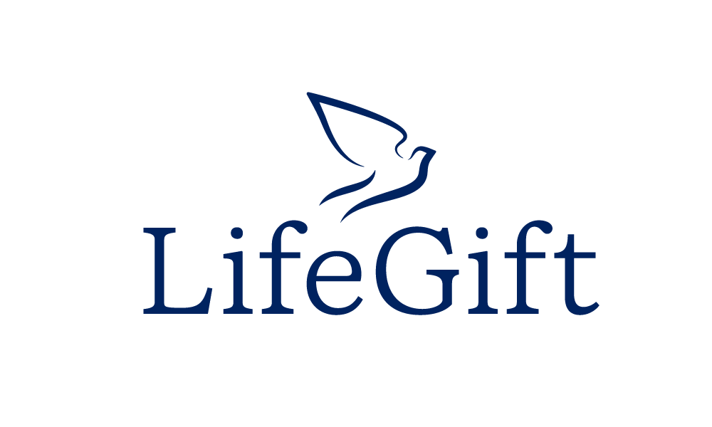
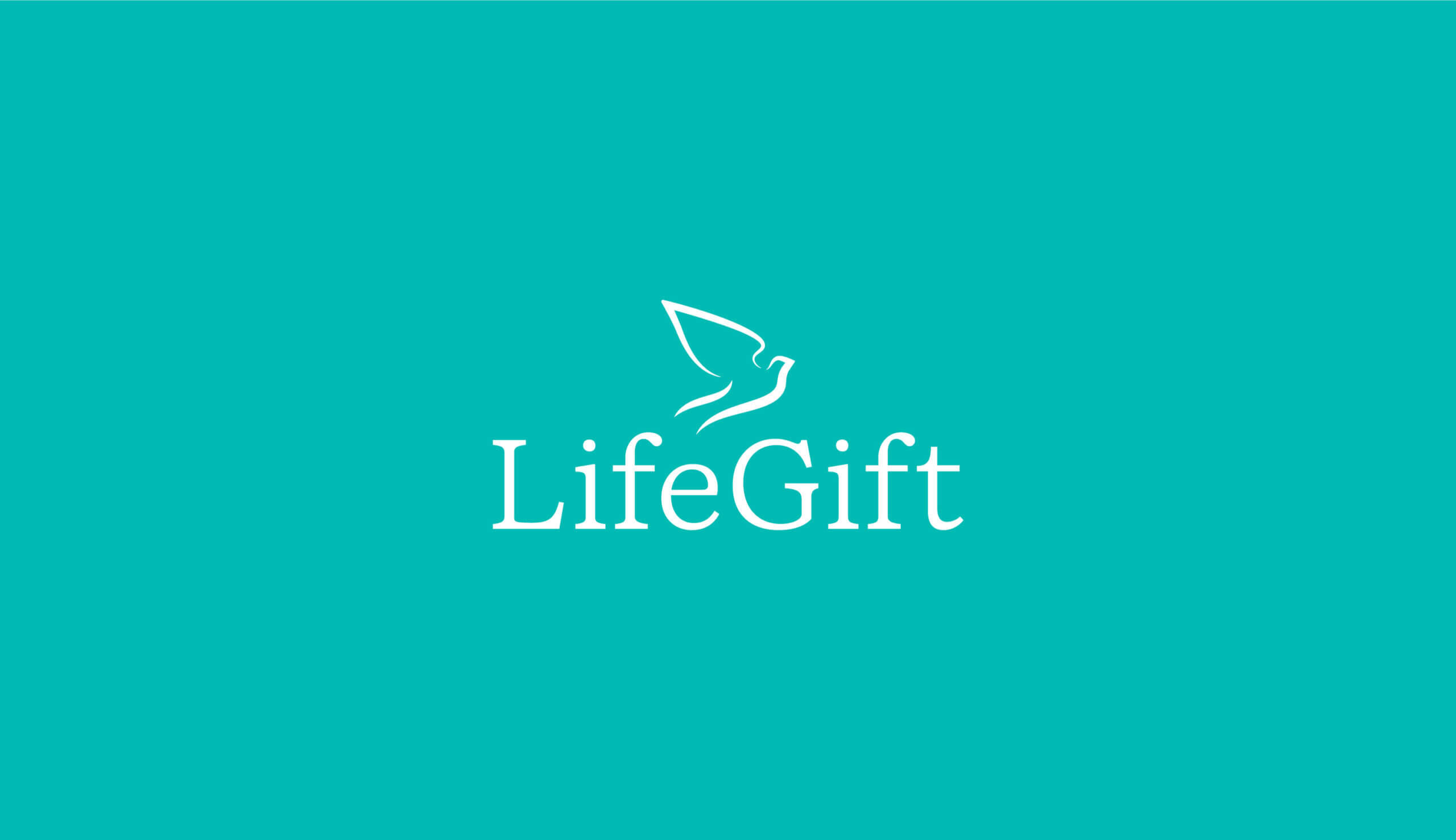
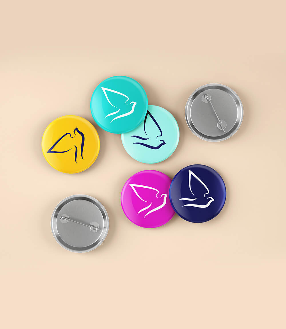
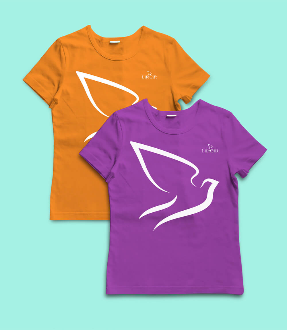
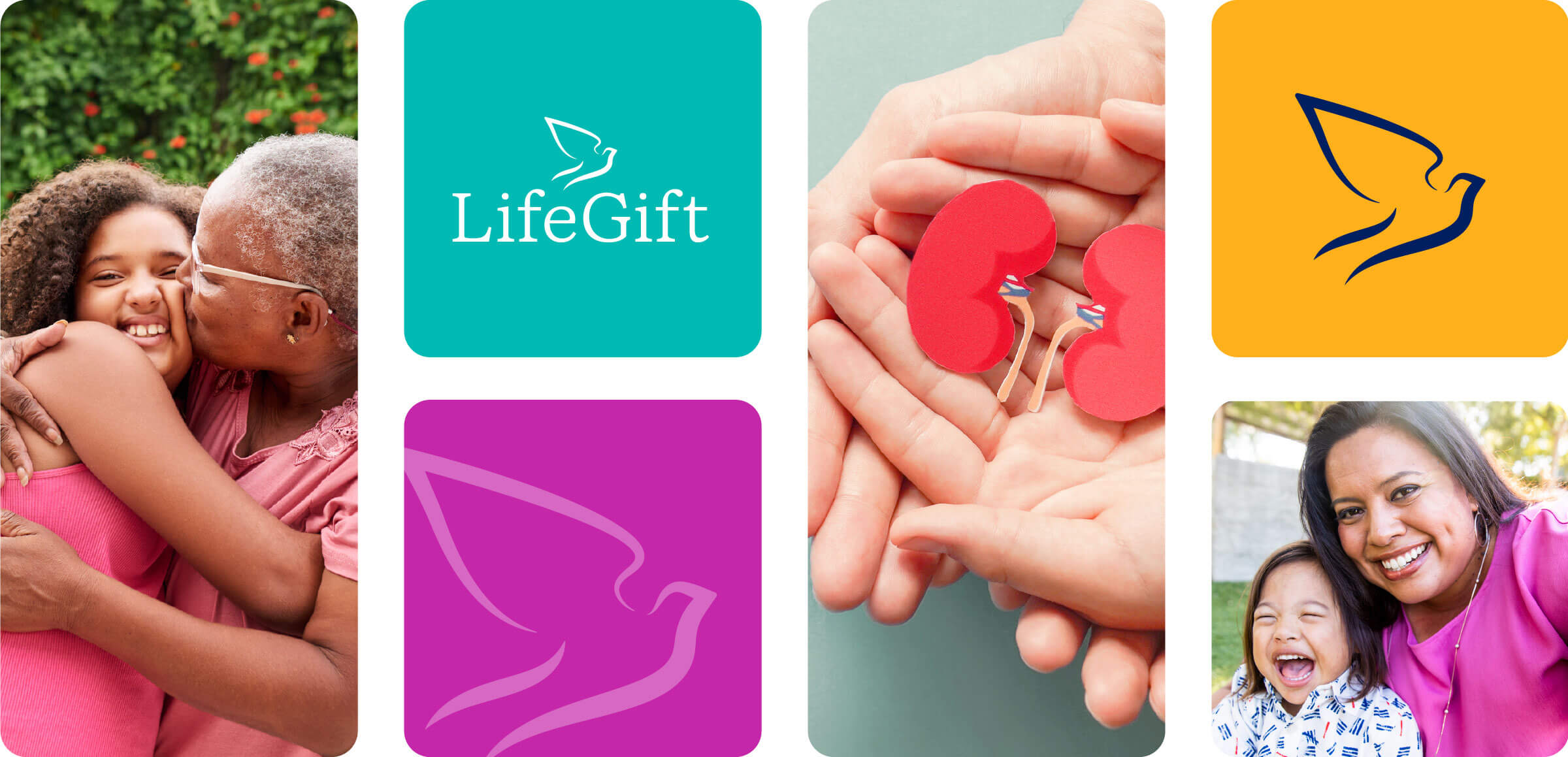
As part of the web experience overhaul, we developed a refreshed look and feel for the organization’s logo and brand elements, expanding the color palette, updating the logo form and typography.
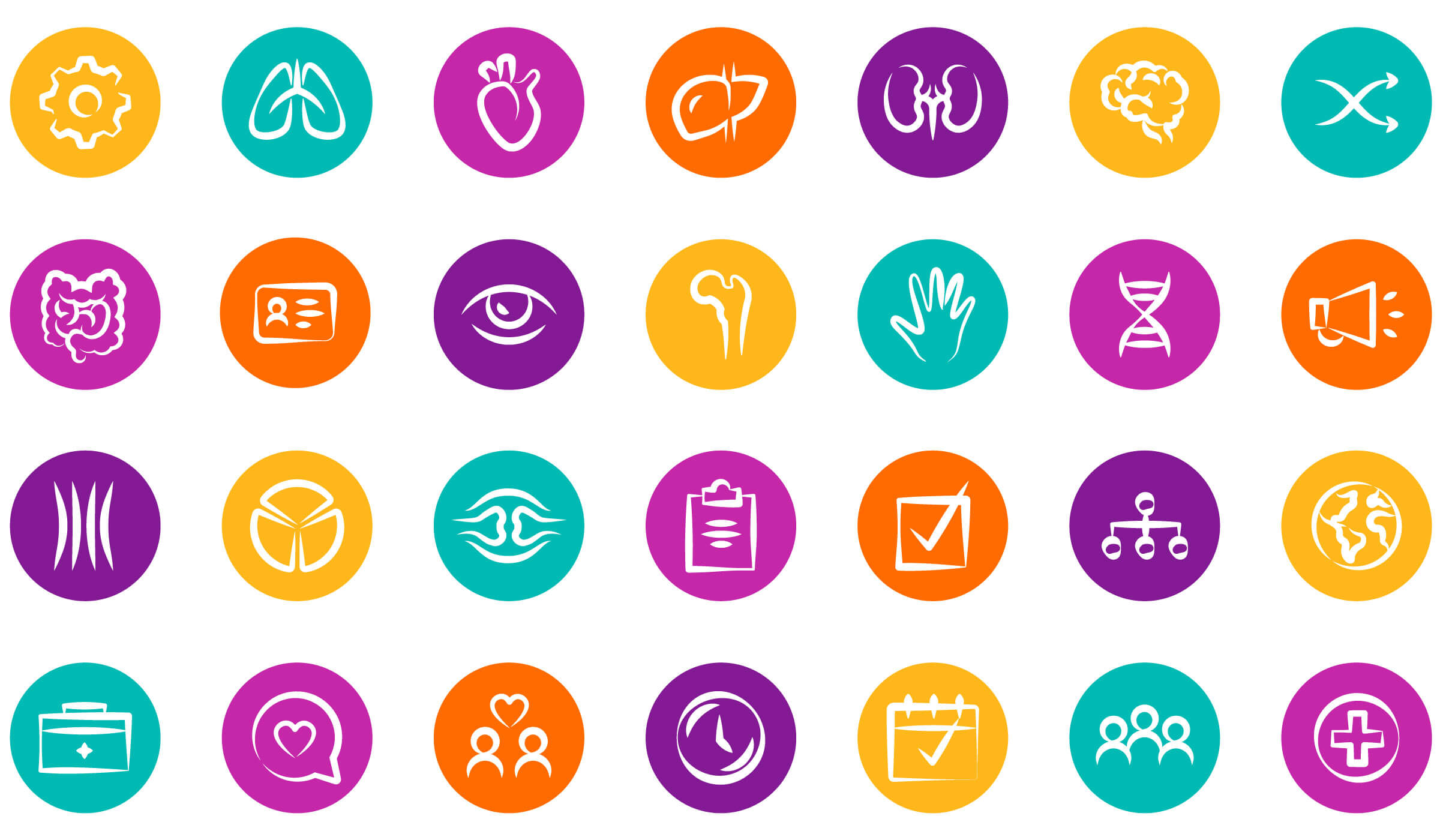
We kept ties to the original logo, elevating it to a more timeless font that was both clean, balanced and approachable. Pulling inspiration from the hispanic communities served by LifeGift, we updated the brand colors to be more warm, friendly and welcoming. Custom iconography was designed to complement the logo mark and illustrate the different parts of a complex process simply and beautifully.
The New Website
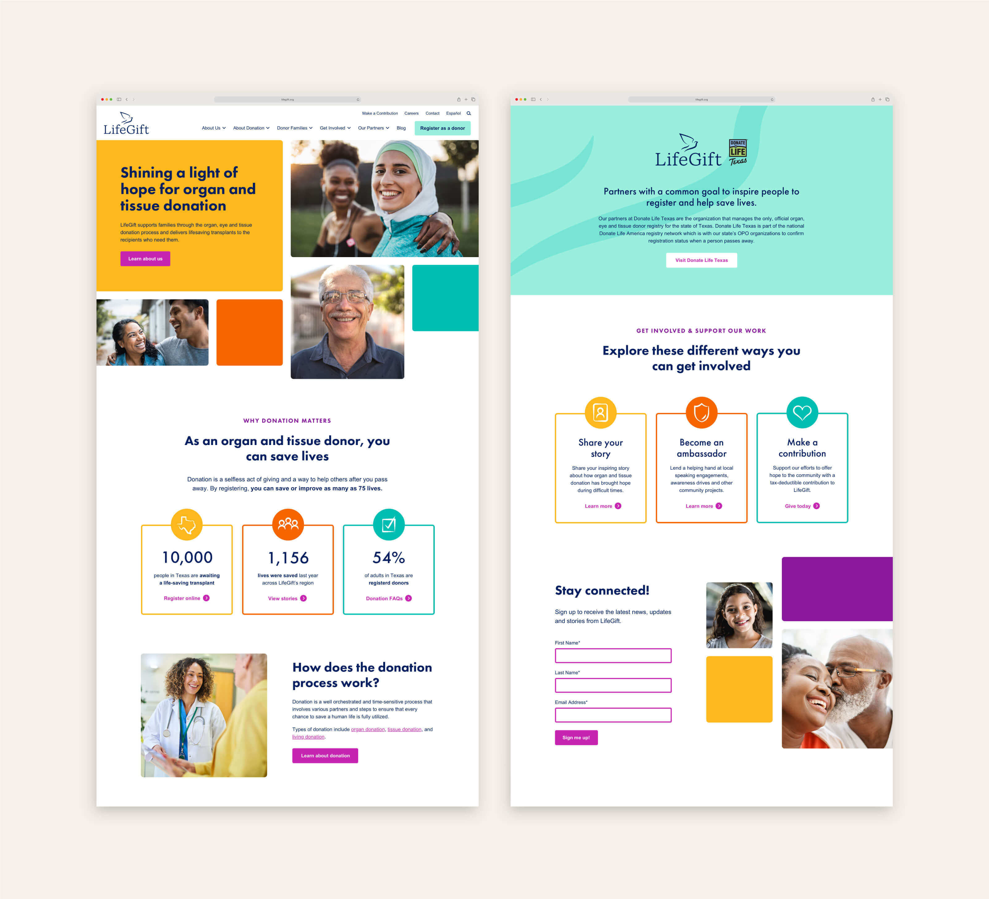
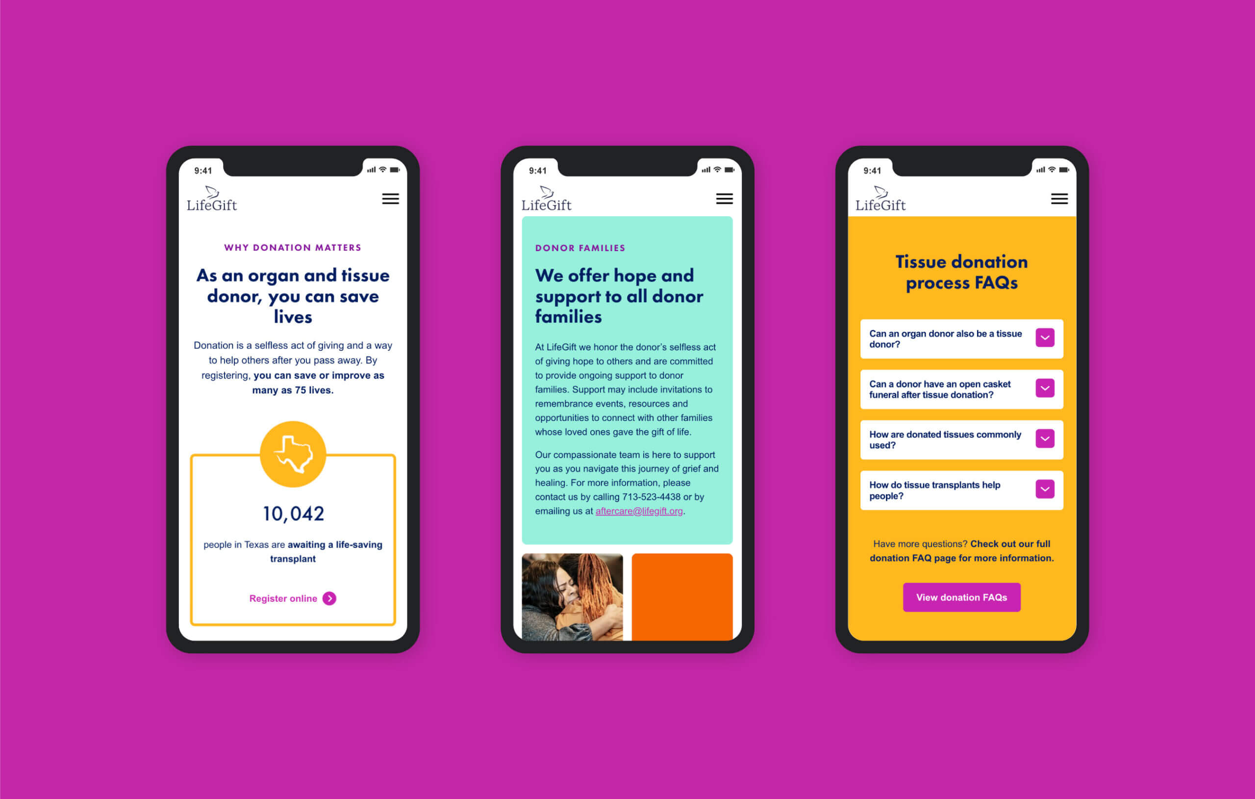
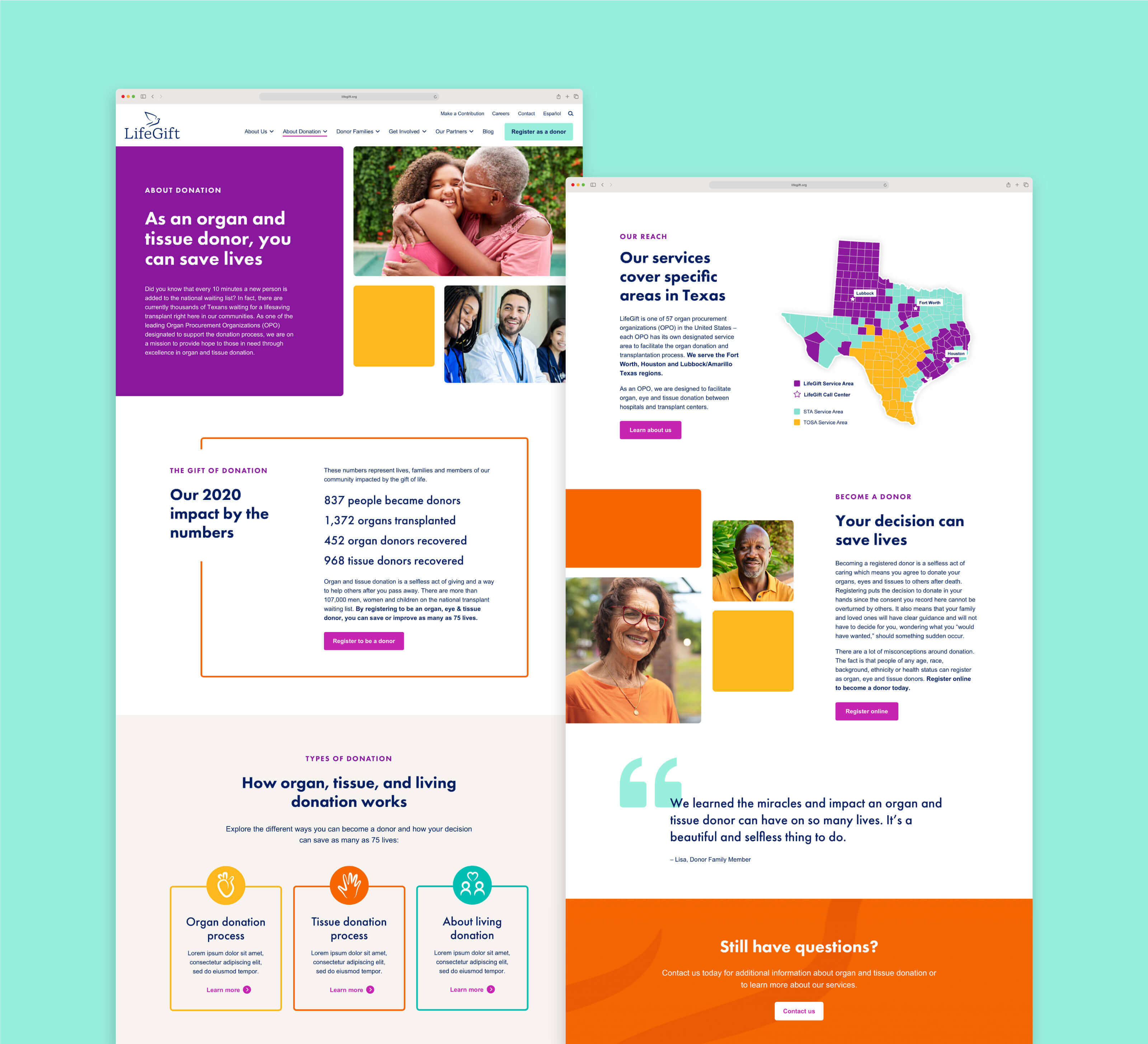
Through a comprehensive website audit, content review and research process, the site’s content, messaging and backend were redesigned for a more positive, inspiring and intuitive user experience. The content was transformed to include meaningful information for each audience leading to increased engagement, and set up with keywords and links to improve web and search engine optimization. Structure and design choices prioritized representation, usability, efficiency and translation.
One of the main objectives for the new website was to ensure it reflects the diversity of the communities LifeGift serves and convey the humanity of the work. The visual style of the website with the mosaic of frames and color blocks is evocative of the community coming together to celebrate second chances and life.
Next Project:
Blue Cross Blue Shield of Minnesota Impact Report