K’ul Chocolate
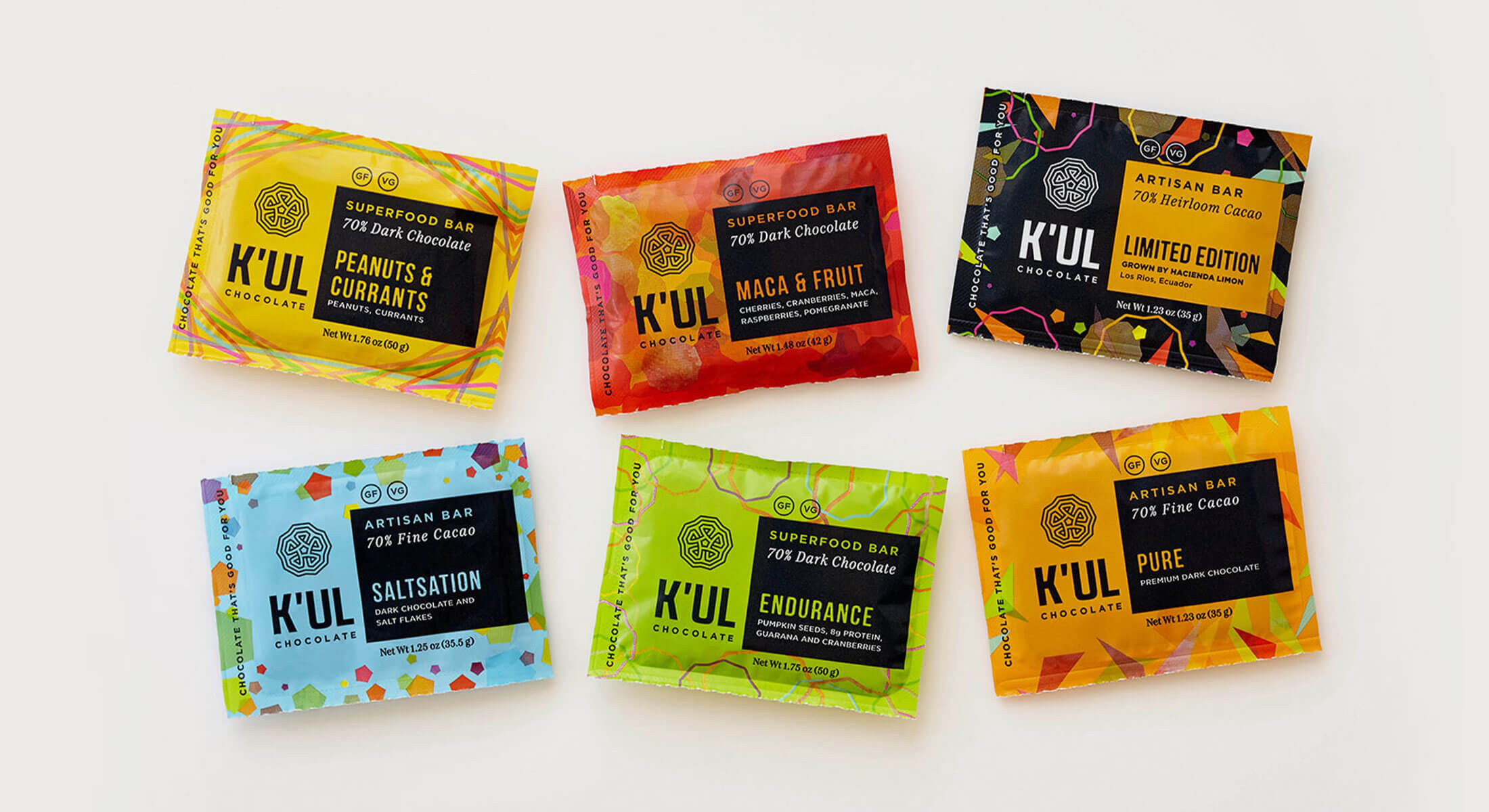
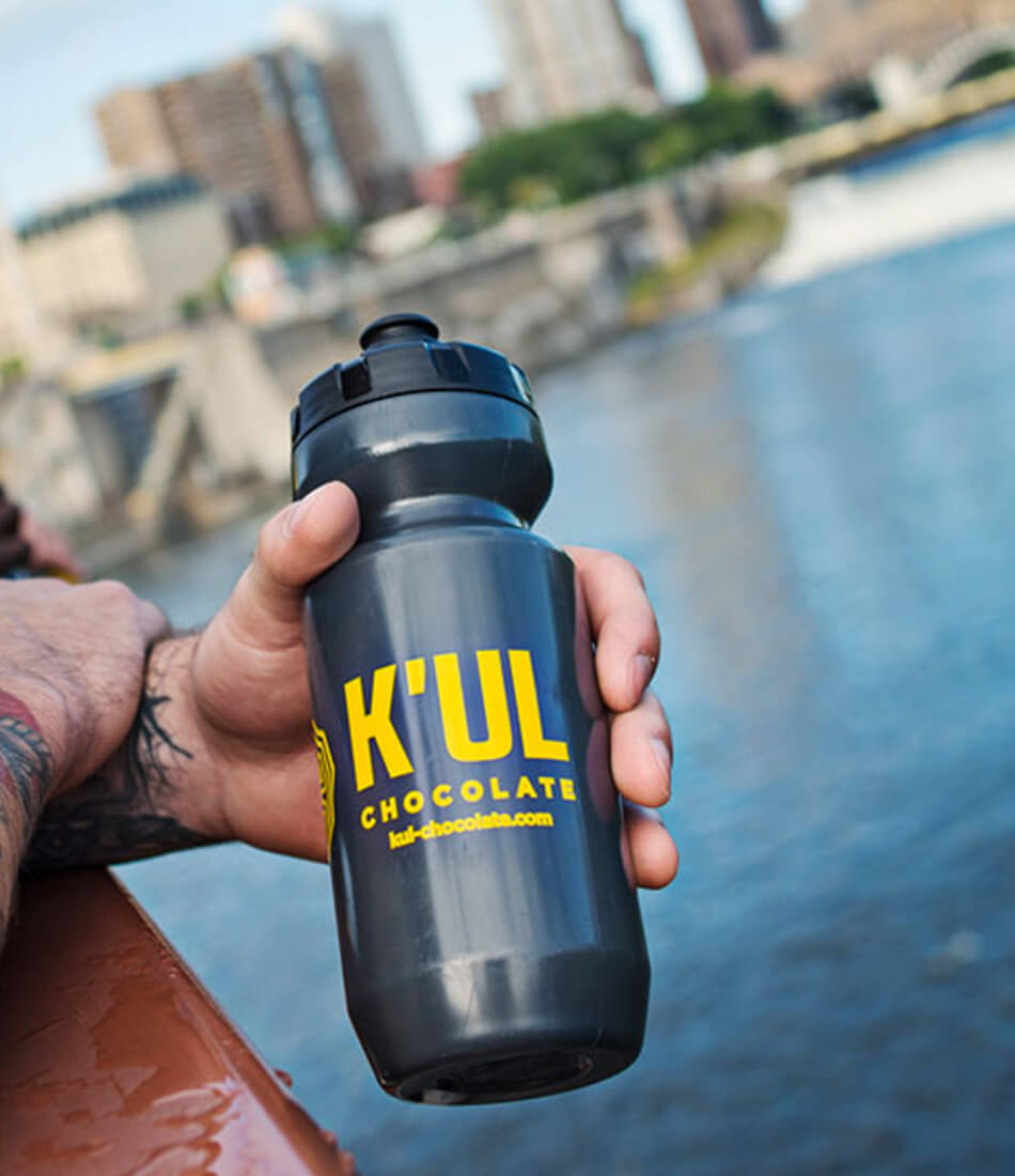
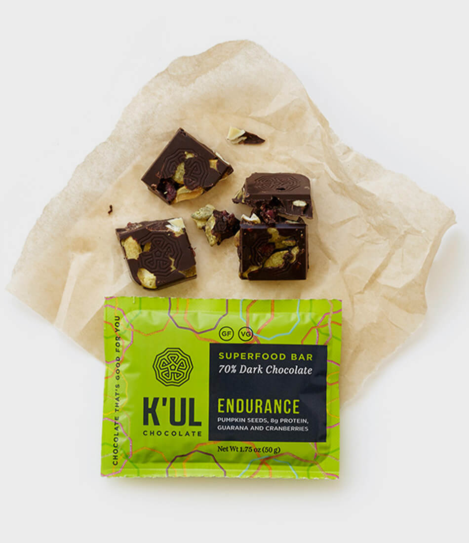
K’ul Chocolate came to us with a single idea – create functional chocolate bars from all natural ingredients that are good for you. The name, K’ul (pronounced cool), comes from the Mayan word for energy, which is what their bars are designed to provide and what we set out to communicate with their brand.
The Project
Logo and packaging design
The Challenge
How does a new chocolate brand launch itself into a saturated market while appealing to a diverse and adventurous audience?
The Solution
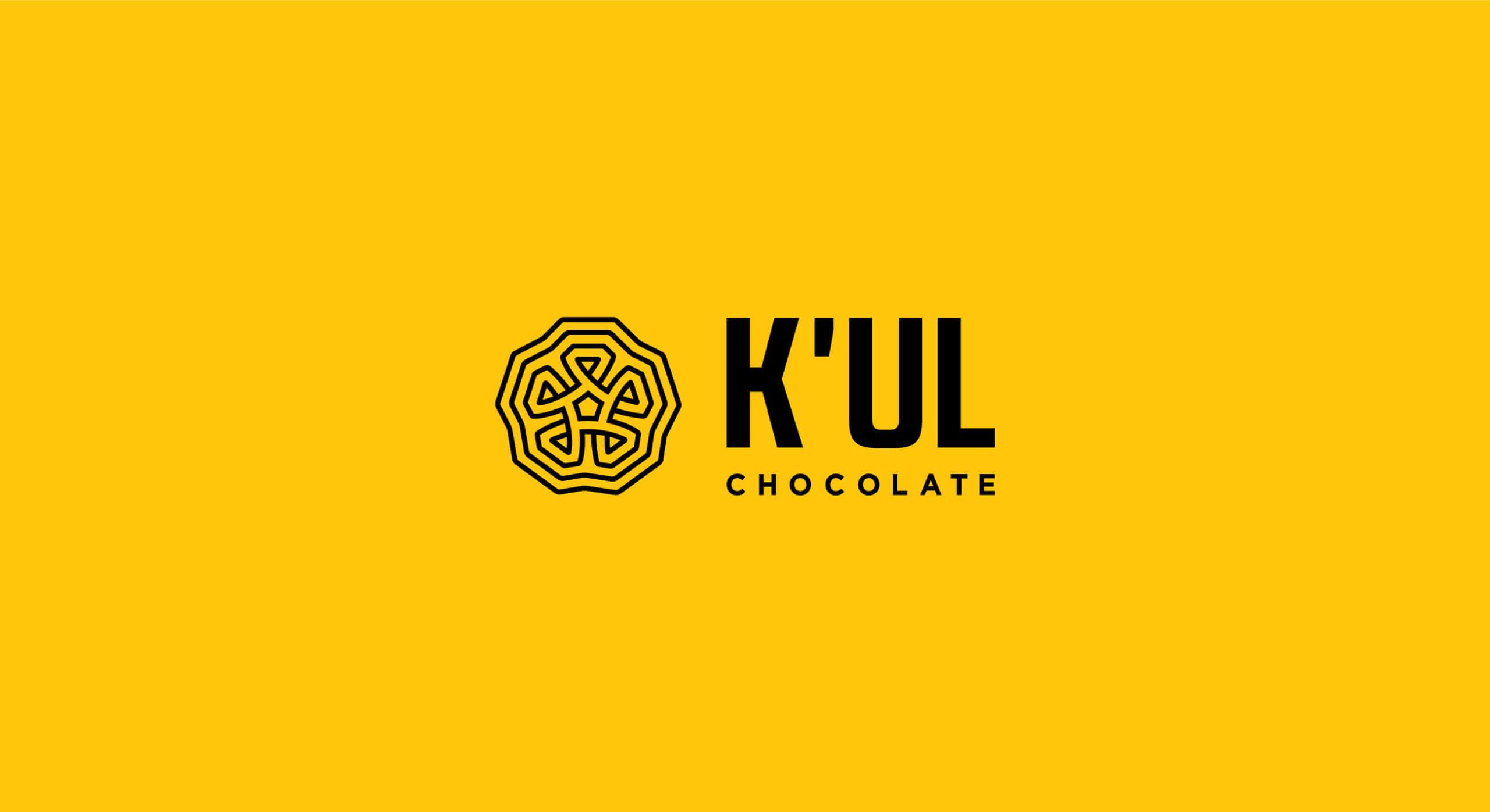
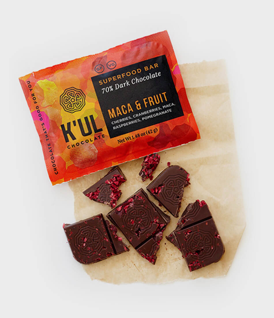
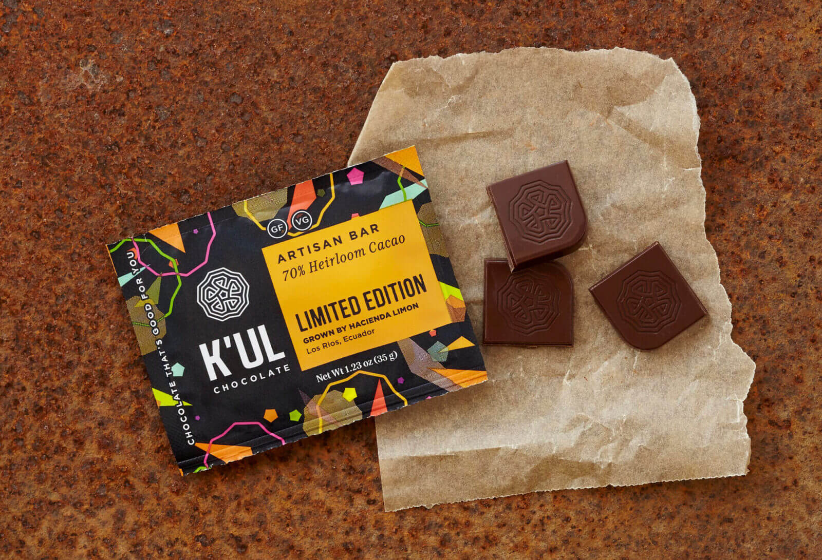
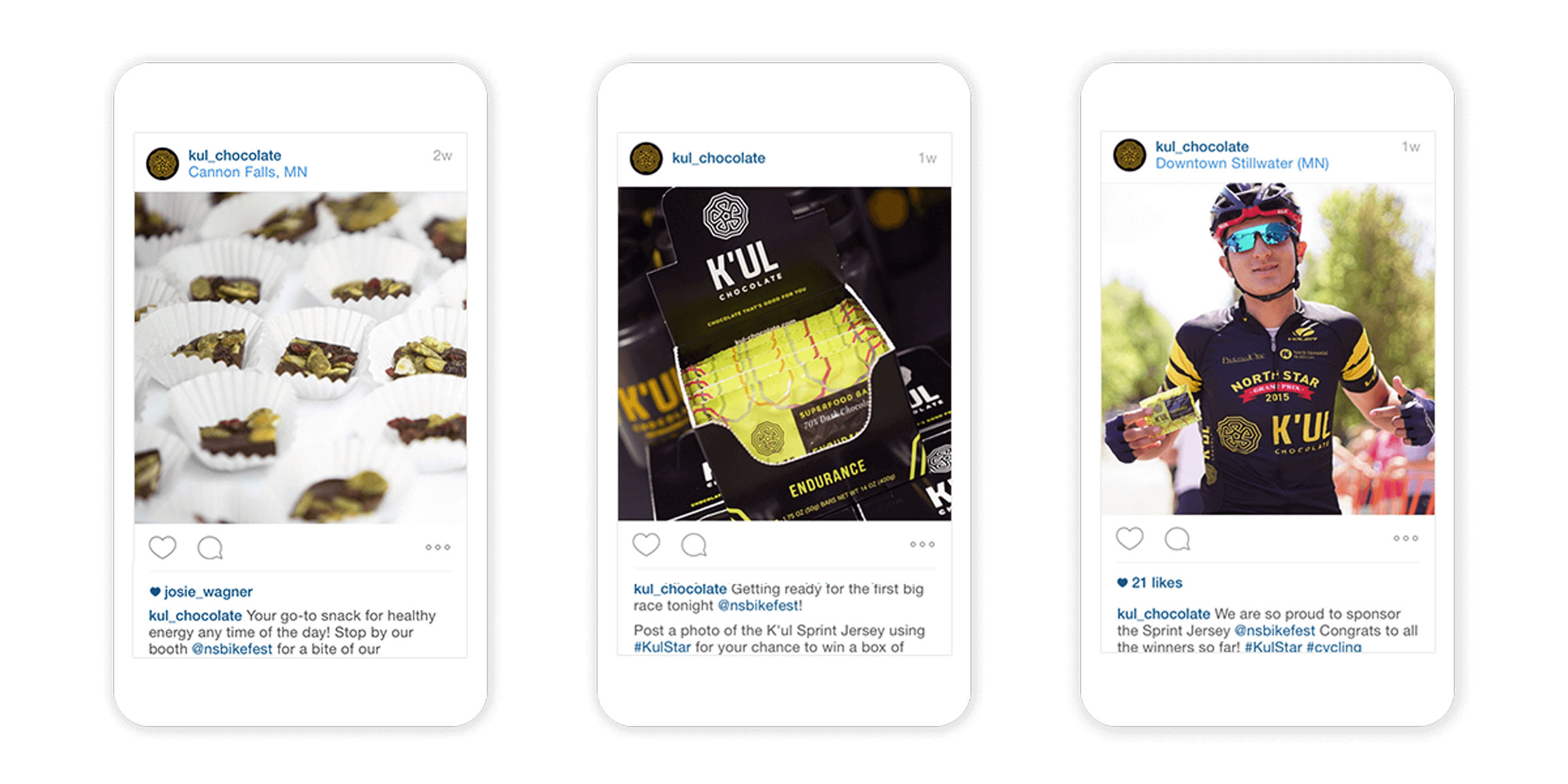
Position K’ul Chocolate as a disruptor – a brand that will change the perceptions around chocolate and create a new attitude for this ancient indulgence choc-full of health benefits – Chocolate is not candy. Chocolate is food. The identity design was inspired by the structural characteristics of cacao beans and meant to symbolize the word energy. Through a comprehensive brand strategy we enabled K’ul Chocolate to set a new standard and raise the bar. Vibrant, fresh, engaging, smart and approachable were the key attributes that guided the entire brand development from the logo to packaging design and the entire online presence. To start spreading the word about this new paradigm we created #BeansWithBenefits and took the conversation online.
Awards
AdFed The Show, Silver Award, Logo Design

“A year ago I started the new business and had no question of who I wanted to collaborate with to create a new brand. Today we have a logo, packaging look, and website that is creative, forceful and communicates exactly what I was dreaming of. I strongly recommend 5IVE to anyone looking for thoughtful innovation in branding.”
Former K’ul Chocolate Owner

Next Project:
Ultra Machining Company Brand Refresh