Drive Electric Minnesota
Drive Electric Minnesota is a partnership of Minnesota’s Electric Vehicle (EV) champions, dedicated to encouraging the deployment of EVs and the establishment of EV charging infrastructure through public-private partnerships, financial incentives, education and public policy.
The Project
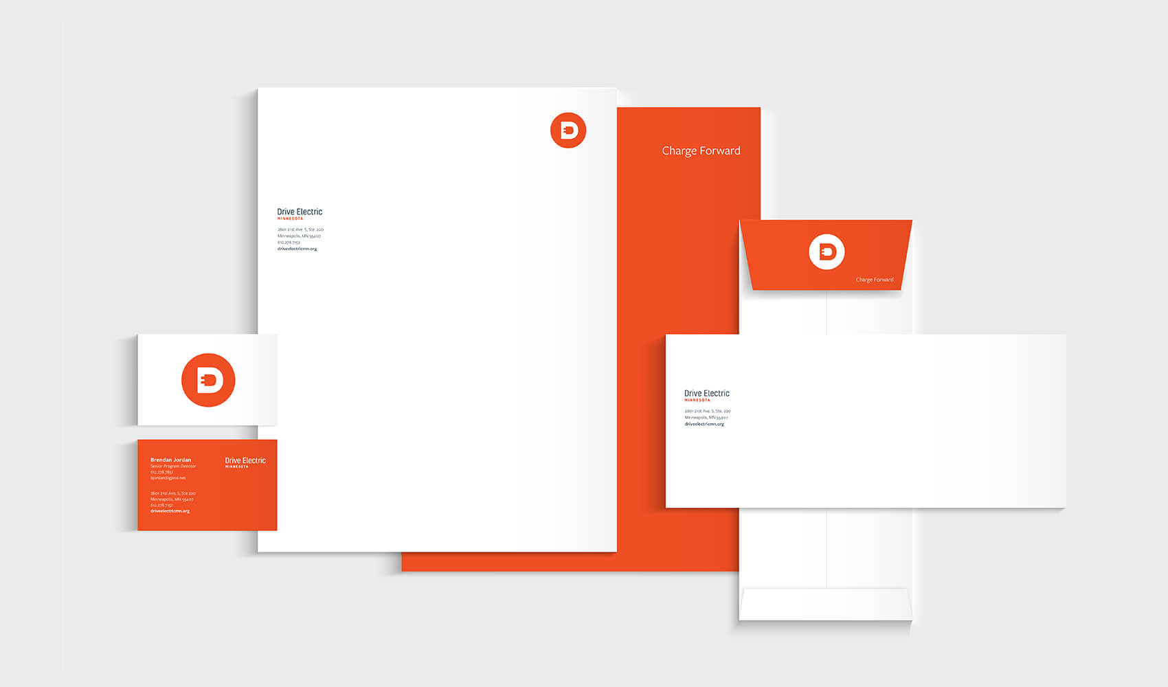
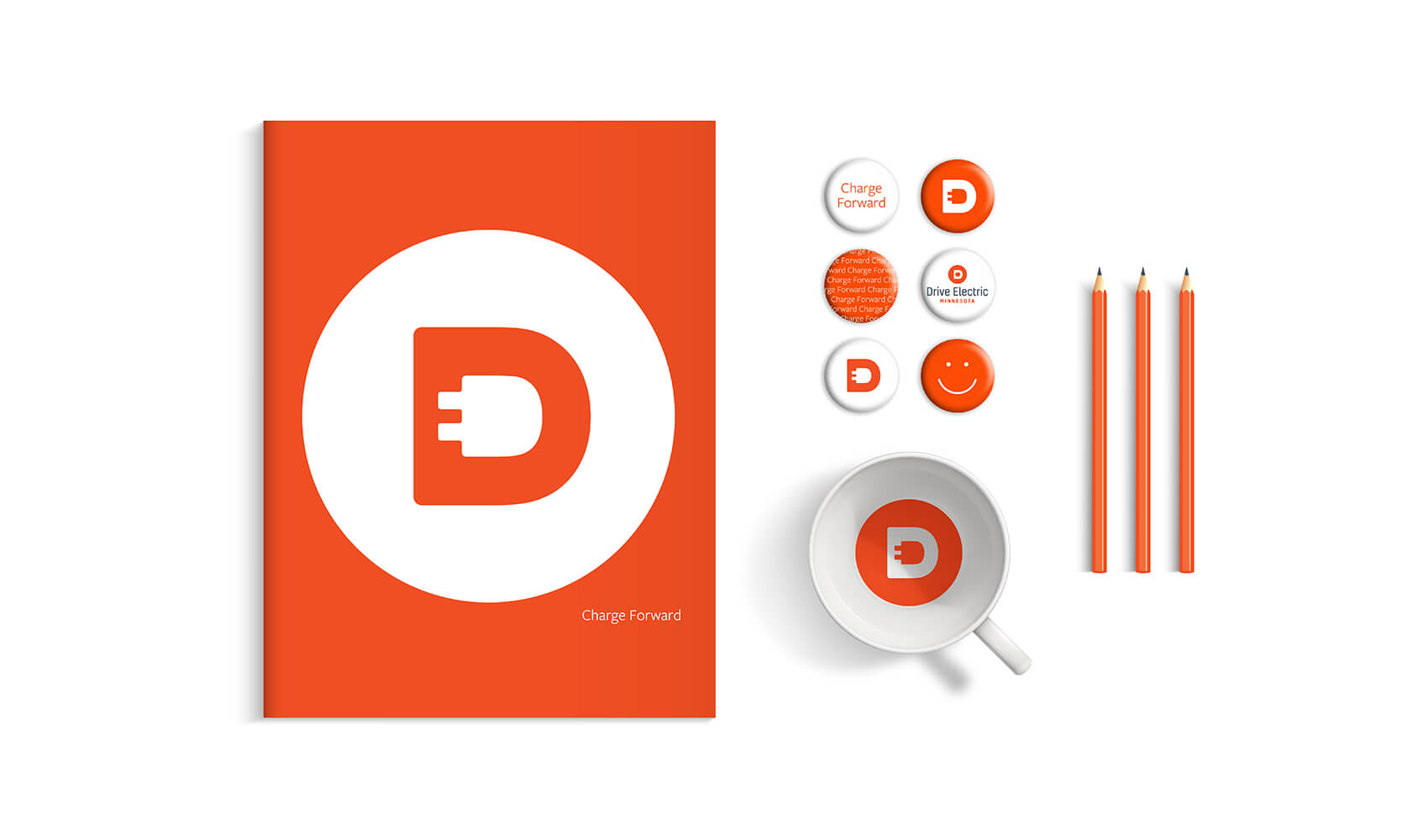
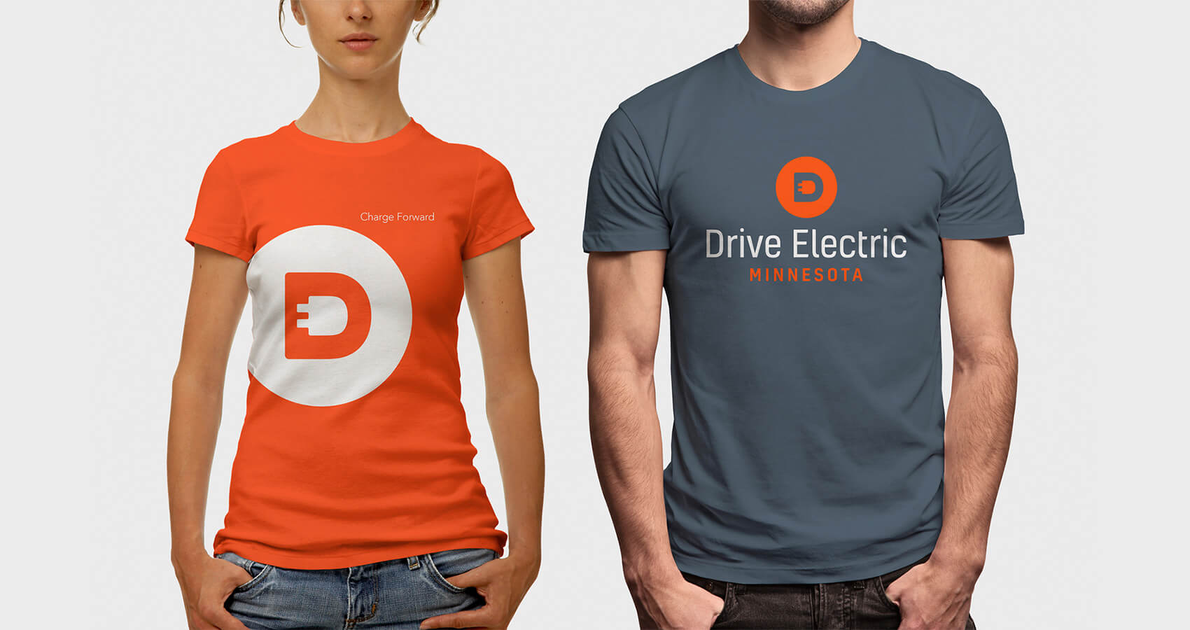
Logo and brand design
The Challenge
Develop and implement a brand presence that will help Drive Electric Minnesota raise awareness, attract new members and establish itself as the premier Minnesota organization leading the deployment of electric vehicles and the go-to resource for electric vehicle consumers.
The Solution
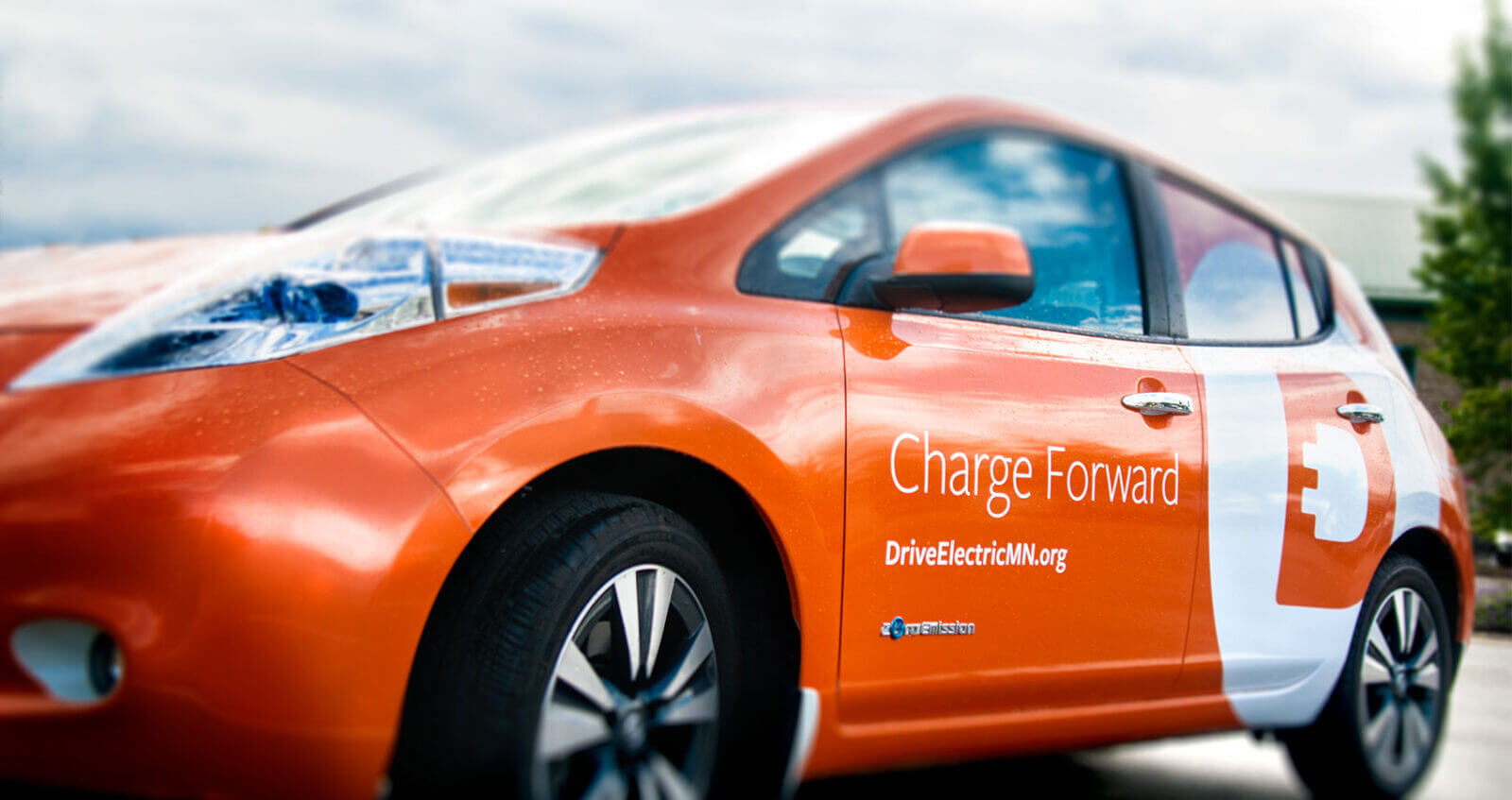
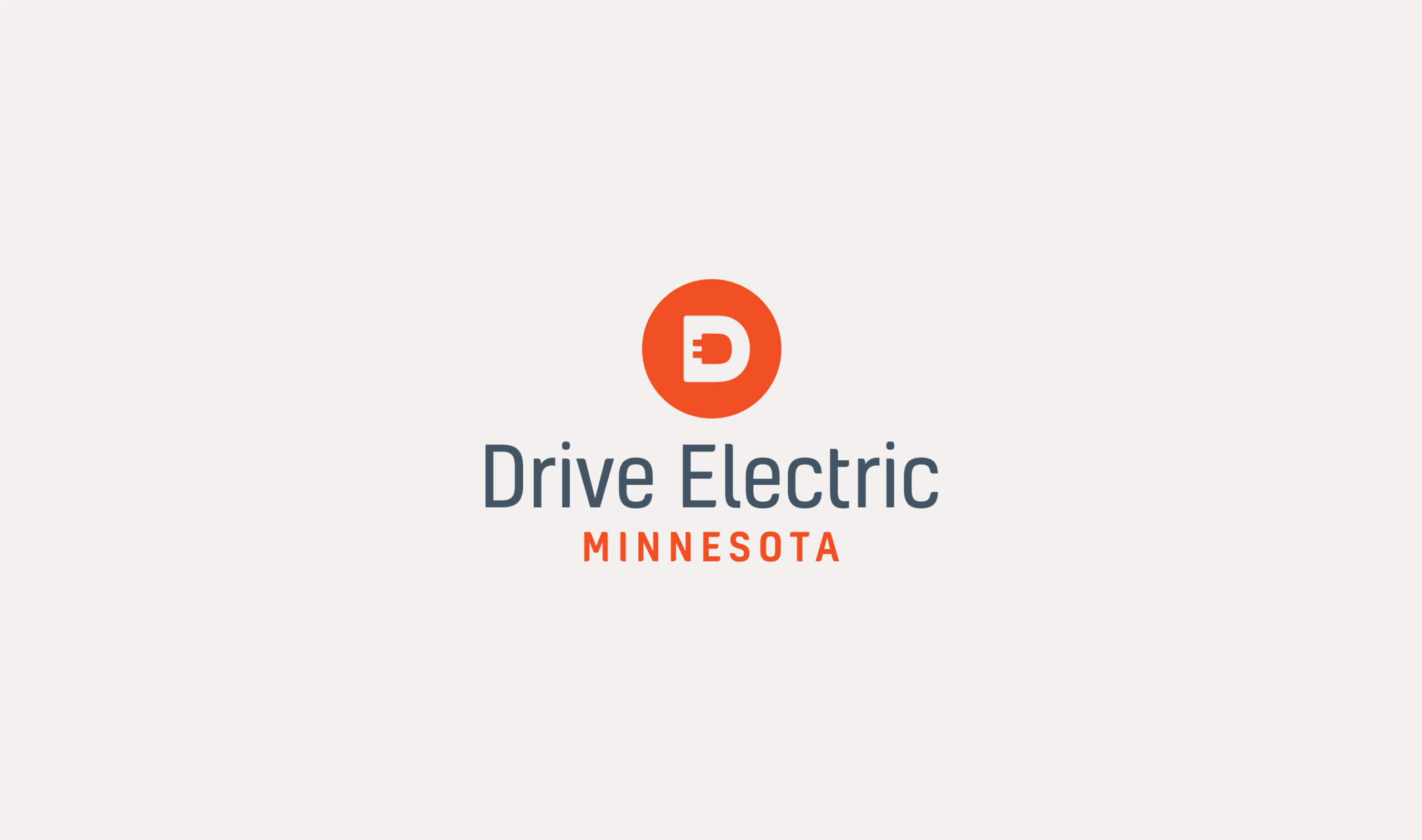
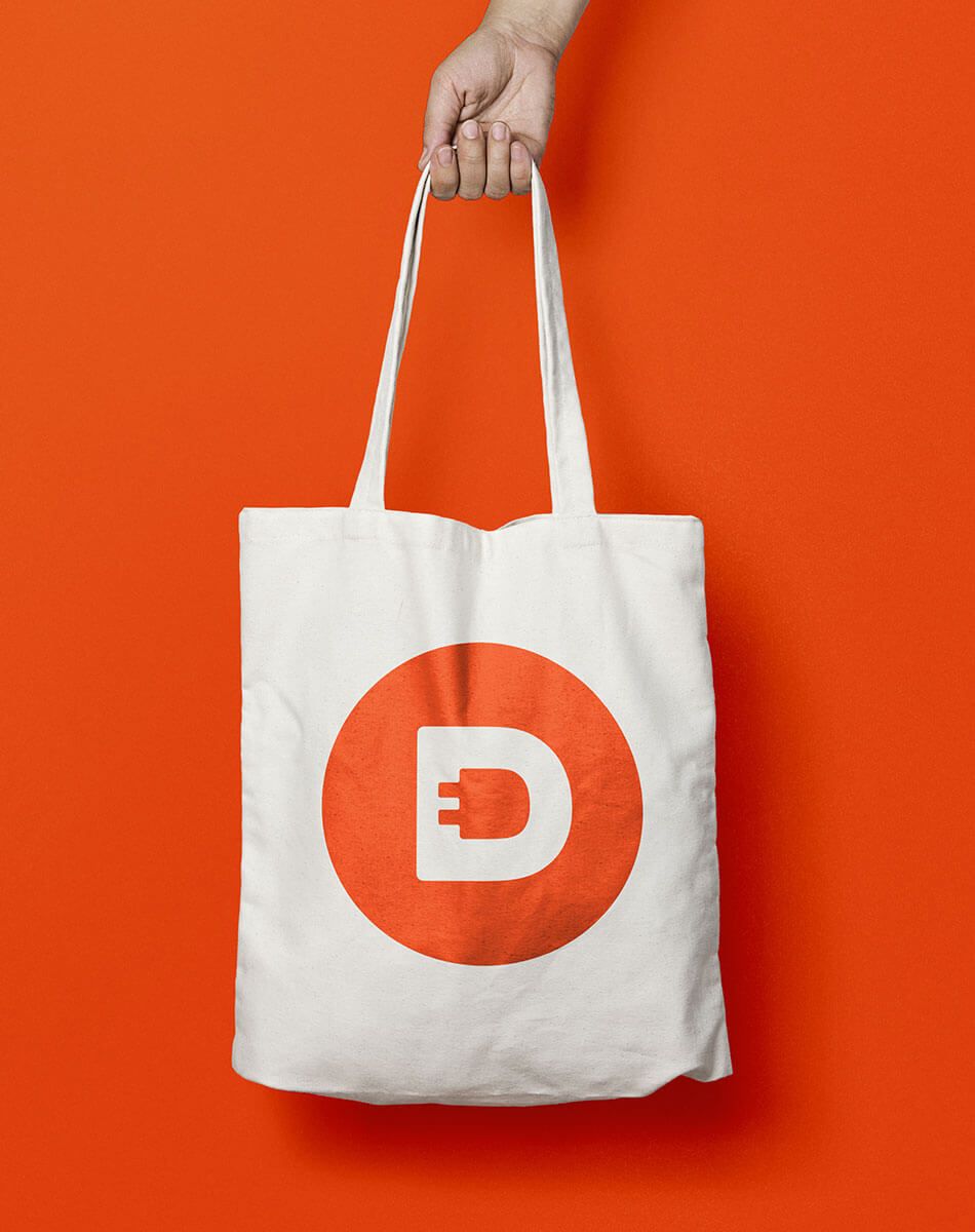
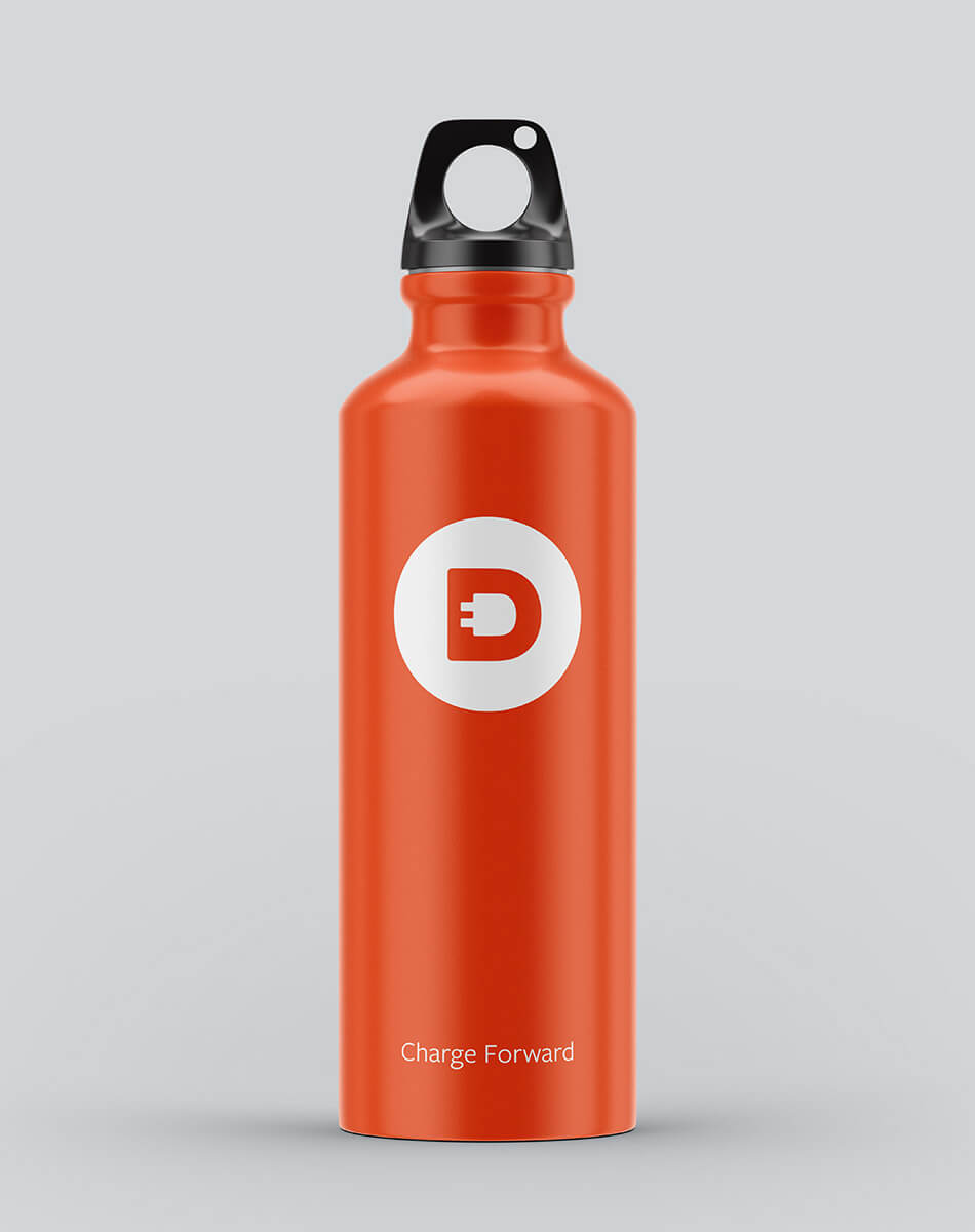
In order to motivate Minnesotans to drive electric, we focused on the future – designing a contemporary logo that grabs attention, promotes action and embraces the spirit of forward-thinking. Moving away from the typical green and blue colors dominating the sustainability sector, orange and steel gray were selected to communicate the brand’s vision, mission and business goals. The orange electrifies and attracts while the steel reflects the innovative and modern design behind today’s electric vehicles. A circle reminiscent of a power button ready to set a car in perpetual motion was used for the mark. The plug was seamlessly embedded into the “D” to create the letter “E”, allowing the mark to become an iconic extension of the organization’s name and function as a standalone tool for communication. In a sea of blue and green competitor logos, this iconic branding is able to break through the noise, be easily recognizable, and stand up to the rest of the auto world, but most importantly inspire more people to consider the shift to drive electric. To set the brand in motion, we finished the branding process with a new website and slogan “Charge Forward”.
Awards
AdFed The Show, Silver Award, Logo Design
AdFed The Show, Bronze Award, Stationary Package
“The speed of this branding project was truly exciting, yet incredibly smooth. With a tight deadline, 5IVE was able to get behind the wheel and help us bring our organization to the next level in record time. They have been a valuable business partner and integral part of our team. By developing a comprehensive brand strategy and focused vision, 5IVE enabled us to bring Drive Electric Minnesota to life and establish ourselves as a serious player in the electric vehicle game.”
Brendan Jordan, Vice President, Drive Electric Minnesota
Next Project:
Nuclear Hydrogen Initiative Identity Design